By late summer Inbox.lv has launched updated version of Inbox Mail, which includes not only small improvements in functionality, but also is the first phase of the project, related to the design changes.
The idea to re-design Inbox Mail came not of a sudden, we had it long time ago, wanted to make our product better and easier to use, to add new design elements and colors. But it’s no secret that new design is a very responsible thing to do. Inbox.lv team took these changes seriously and thoughtfully. We dedicated much time to the study and analysis of all the comments and suggestions from users, in order to understand what is convenient or inconvenient in the interface, what we need to change, and what not. We had many design projects, then gradually the final project emerged, and we hope our users will also enjoy it.
We will not hide – a lot of changes are planned, but do not worry, everything will be done gradually, step by step. Most of the changes will affect the color palette, some places will have different location of items, and we will add new icons and other designer items that definitely will make You happy.
The first changes can already be seen in the Inbox Mail section. First of all, the main toolbar has new view – color palette is changed and icons for menu items are updated.

Earlier, after choosing the “Contacts” section, the main toolbar changed, which was rather inconvenient. Now the menu items that belonged to the “Contacts” section have been moved from the main toolbar to a separate new additional menu below.

We can’t help but mention the standardization that reached Inbox Mail. Not only were all of the buttons of Inbox Mail brought to the standard view but also the main toolbar with the products. Products’ panel no longer has the “envelope” icon ![]() , instead of it, being in the mail section, You can use the “back” button in Your browser, which will bring You back to the previous page you requested. Also, “Exit” option was moved to the right, as in all our other products.
, instead of it, being in the mail section, You can use the “back” button in Your browser, which will bring You back to the previous page you requested. Also, “Exit” option was moved to the right, as in all our other products.

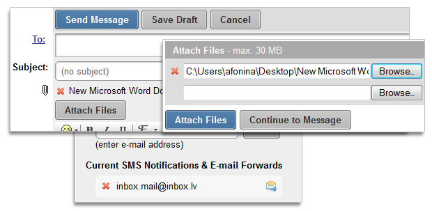
Changes were made to the file attachment’s section, where we have replaced the link with the text “remove” by the icon ![]() and moved it from the right side to the left. Exactly the same change was made for the SMS notifications’ section.
and moved it from the right side to the left. Exactly the same change was made for the SMS notifications’ section.

This version also comes with fixes of letters’ sorting, documents’ viewing in MS Office 2010, we eliminated small technical problems for SMS alerts and names of recipients.
Currently Inbox.lv is working on the next version of Inbox Mail, which will include the visual changes in the folder tree on the left side and in the letter sections.

