During 2012, Inbox.lv portal repeatedly carried out surveys to find out what users wanted: what should be changed, which features seem to be most relevant, and which ones should be added or improved. After analyzing the data, we are slowly trying to implement most common wishes.
Today we would like to present an overview of the major changes in Inbox Mail. Most of the changes have affected the appearance of the mailbox. Three main points can be stated after the second phase of mailbox redesign:
1. Changes in the appearance of the folder tree panel and display area of the message list
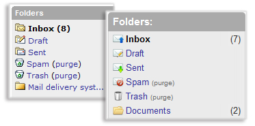
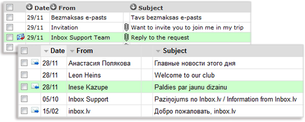
Icons have been updated for the new, answered and forwarded emails. Also, we’ve changed icons for all folders. Bold and underlined font, which was used to display text information, has been removed and replaced with the alignment effect. Color palette for panels and background fills has been slightly changed to a soft and harmonious tone. Font has been increased by 1 pixel in size to a standard 12px, as for other Inbox.lv products. Green icons, previously used to scroll through pages of letters, were changed to meet the new style, now these icons are square-shaped and with arrows. Changes have been applied to the unit with the display of information about the size of Your mailbox.

We wanted to create a feeling of lightness and space, add an effect of increasing the text size for better look-and-feel and simplicity.

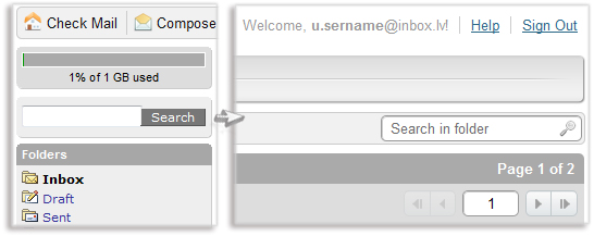
2. New location of search field
Earlier, the search field was located on the left side above the list of folders. Now it has a new location – on the right side, where the clock used to be. This arrangement is not accidental – right side is a standard location of the search field in all inbox.lv products. The search filed has been moved to the right side in the “Contacts” section as well.

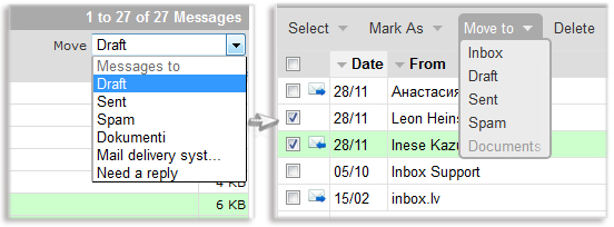
3. Changes in the “Move to” feature
The “Move to” feature has changed its place and now is located next to the other options for letter management. Also, we’ve simplified this function for a more comfortable use. To move the selected letter, You just need to press the button “Move to” and choose the folder form the drop-down list. After it, all selected letters will be automatically transferred to this folder. Along with these changes we’ve also redesigned other drop-down menus.

And even more…
Minor changes in the “Folder” section: duplicate text information has been removed; links to folders and filters have been added for quick and fast navigation.
Clicking the Purge button in the Spam folder now brings warning text message in order to prevent accidental deletion of all content if wrong clicked.
After sending a reply to the letter, users now have the opportunity to immediately return to the original folder. Also, two additional buttons are now available if You need to quickly jump to the next or previous message.
We hope You will enjoy the new Inbox Mail. You are welcome to share Your thoughts and suggestions on our feedback page http://inx.lv/z7a.

